Back in September 2012, the team at Shout Out Studio schemed up a website for ourselves.
During the planning meeting, we threw out an idea that a load of content marketers probably dream of: “What if our site was first and foremost a space to share content?”
Rather than have a “typical marketing firm website,” we’d focus on making our website a go-to resource for our clients (and probably our competition too).
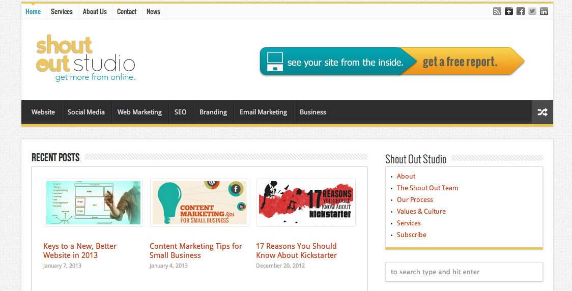
For this reason, our original homepage looked more like an online magazine than a business’ website:

Once that site had launched, we asked a lot of folks to give us feedback. One thing we heard was “It is kinda hard to find out more about your company.” This is exactly what we expected and – to be honest – what we wanted. We wanted the resources to shine and our company to be along for the ride. So we pushed forward…
After paying close attention to our own Google Analytics and setting up key performance indicators for ourselves, we came to the realization that our site was effective in the way we thought it’d be, but not at driving leads and helping us start conversations with folks. We knew that was the risk and we learned.
So now, we’ve landed on version 2.0 of ShoutOutStudio.com.
What We’ve Noticed Since Switching to our New Website
Traffic from Search Engines Has Improved
While we’ve written fewer new articles and changed the nature of our content, we’re enjoying a continual increase in traffic from Google. We’re ranking for much broader keyword profile as well as increasing our CTR in SERPs. Moving in the right direction!
Generating Leads is What Site is About
Not only is our site still a pile of resources for our clients (and others interested in marketing), but it now is useful for someone who wants to educate themselves about Shout Out Studio. When someone is referred to us, it’s no longer uncommon for them to fill out our contact form to begin the conversation.
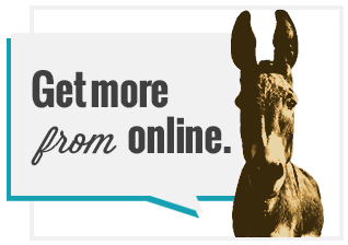
 Folks Love Our @$$
In the formation of the new website, Nathaniel created a placeholder graphic with the graphic and copy you now see on the homepage. The rest of the team immediately fell in love. We ran it by a few folks and they chuckled and said it made them smile. Since we LOVE making folks smile, we kept it.
Producing Fewer, Higher-Quality Resources is Better for Everyone
In version 1.0 of our site, we wanted to be publishing 4 or 5 articles a day. To keep up with that pace, quality dipped lower than we’d like. In version 2.0, we are concentrating on longer, thorough, impacting resources. We even began producing free ebooks to equip business owners to get more from the web. That has been far more fun for the team and we’ve seen engagement numbers increase as well. Everyone wins.
Key Lessons from Our Website Refresh
1. We had to Take Our Own Medicine
We love to experiment and encourage our clients to experiment in a lot of different directions. Our first website was an experiment that taught us a lot. When you’re willing to test and fail, you’re going to fly further.
2. Make Sure Your Marketing Is Aligned with Business Goals
Originally, our website goals weren’t directly tied to our business goals. We were more focused on being a resource center than connecting with potential clients. While the first isn’t a bad goal, the latter supersedes it.
3. Let Your Creatives Have a Load of Freedom
Our team had a bit more creativity to play with the functionality, style and overall feel of our new site. This created a situation where all of our strengths are far more evident in the new site than in the old. The format of the old site put a certain amount of constraints on the team that didn’t lead to best brand experience for our site visitors. The more we opened up space for the creative folks to fly, the happier we were with the result.
4. Having a Solid Content Management System Makes Life Easy
We love WordPress. This CMS gave us an opportunity to completely rework our website at break-neck speeds. Thankfully, we’re able to continually improve, tweak and edit our site without needing to dig through code every day. Some folks may see learning a new CMS as a challenge, we see it as a strategic investment in our future.
So what do you think? Any improvements or changes you’d like to see on our new site? Any resources you’d like us to produce so we can help you out?

