[vc_row][vc_column][vc_column_text]We’ve talked before about the importance of design and visual identity when it comes to brand communication. That first impression can make or break. So what happens when you get the feeling, or feedback, that your visuals are a turn-off? Change them. Improve them.
You don’t always have to completely throw out the old design and start over. Sometimes there’s no time or budget to start over. Sometimes the bones are good and a refresh is the best approach anyway. Here are 3 tips for cleaning up your logo and visual identity without throwing out the baby with the bathwater.
1. Take a look at your color palette
Following a trend is not the strategy here. You don’t have to change your logo to yellow because it’s the Pantone Color of the Year. Your color palette can date you, however, especially when combined with other outdated design elements and long since passed design trends. Use your color palette for good. It can help you speak brand values and product and service characteristics.
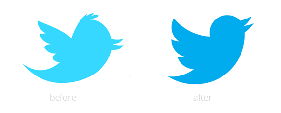
When Twitter decided to freshen up their visuals they not only changed the position and shape of the mark they opted for a different shade of blue. Twitter had decided their little bird had grown up and they reflected that in the color choice.

Read more about what your colors are saying about your brand in this article from Entrepreneur.
2. Consider your typography
The typography you choose or create your logo and collateral speak more than just the words they spell out. Cleaning up the unnecessary use of italicized letters or adjusting word alignment, size, and spacing can make a big difference in the final result. Just like with color, make sure the typography helps you convey your brand’s characteristics.

3. Simplify
Less is more even more in designing a great visual identity. Simplify your logo and design materials trimming back harsh gradients, heavy shadows, bevels, and uber graphic tricks that clutter the form instead of accentuating the form of your design. Simplifying your design not only leads to a more long-lasting mark but helps when you’re using your logo across various types of media.
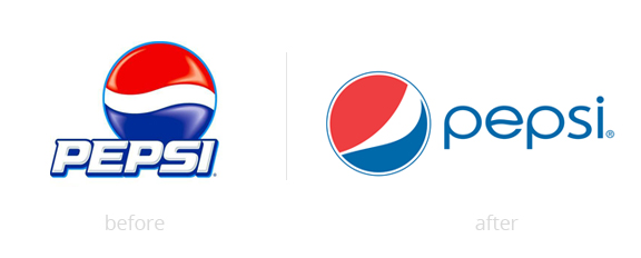
Pepsi freshened their image recently by not only changing typography but simplifying the famous Pepsi symbol, cutting extras like the artificial glare and the heavy stroke from the Pepsi name.


