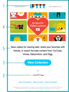
A few months ago, we did a post for our favorite Attention Grabbing Email Marketing Campaigns. As was mentioned by a few team members (myself included) a well-designed, eye-catching email is something that we found to be the most attractive aspect of different campaigns. Being able to grab someone’s attention is the first step in getting the engagement you hope for in email marketing. But what makes for a well-designed email?
The goal is to motivate, not intimidate.
When we talk about good email design in a marketing sense, we are mostly referring to design that marries form and function. The reason this is so important is because it will motivate action, leading to a higher conversion rate. If an email is designed well, a viewer will clearly and calmly be able to locate and utilize a call to action, understand the incentive or promotion, and know who it’s coming from. As a marketer you want to make it as stress-free and appealing as possible. The consumer assumes all of the risk: lost time, doubt in a company, or doubt in security. Using design appropriately can reduce these concerns, and bridge the gap between you and your customers. Here are 5 ways to create an effective and attractive email:

- Use a Header– Put your logo or company name at the top of your email, making it clear who is sending the message.
- Create a Hierarchy- Just like any other form of content, having a hierarchy allows a reader to skim and quickly decide whether they are interested or not. It also helps to break up your content (someone is more likely to skim or ignore a large block of text.)
- Easy to Navigate– If a reader wants to learn more on your site, make it easy for them to get there. The easier you make this, the more likely you are to see conversions. One of the best ways is to have a Call To Action that is pronounced and clear.
- Use Imagery-The power of a picture has been praised repetitively. Using photo and video assets will always help. But it is important not to overcrowd and clutter with visual aids, using only what you need will also keep the file size down.
- Less is More- While this is usually true in most of design; it especially applies to email design. Having a clear message, promotion, or incentive tells your viewer exactly why you were contacting them. Keep your email simple, legible, and organized. This is the best way to get the attention you deserve for your content.
On average, viewers spend around 15 seconds looking at marketing emails. With such a small window of time to make the right impression, use your space wisely. The less clutter, excessive content, and clickable areas there are, the easier it will be to navigate and understand.

