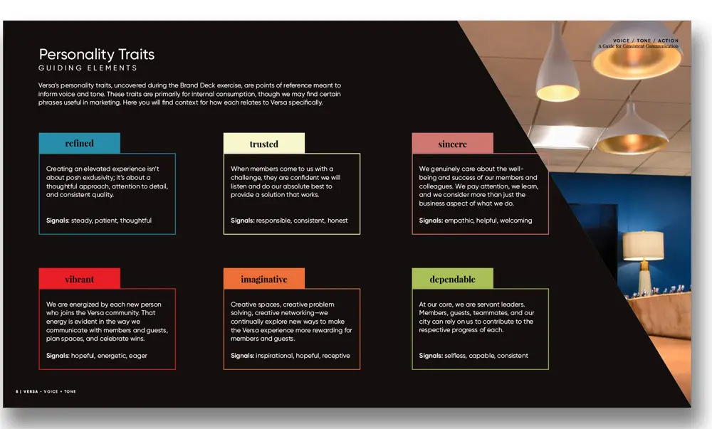
Small adjustments to brand expression in web design can have a big impact on user perception and experience. When we started talking with Versa about a new website design, we asked questions about the brand and business evolution since their last website was created. We wanted to know what they had learned about themselves and their audiences. We wanted to understand how they’d grown or how the brand personality had changed as the business matured.
When evaluating a website, it’s not enough to just say the design and functionality are outdated. Outdated compared to what, and how far? Is there a spectrum? If those are the only points of reference for new design, you’ll spend a lot of time chasing trends. We wanted, and Versa expected, purposeful progress rooted in web design for branding that authentically reflects their identity.
After discovery sessions with the Versa team and collaborative work defining the current brand personality, we started to look at logical ways their identity elements could and should evolve. What needed to shift? What supporting pieces needed to be introduced? After all, why reinvent the wheel when you’re still trying to roll?
Referencing the updated personality work and our experiences with the Versa team and the Versa environment, two particular elements seemed out of place on the current site:
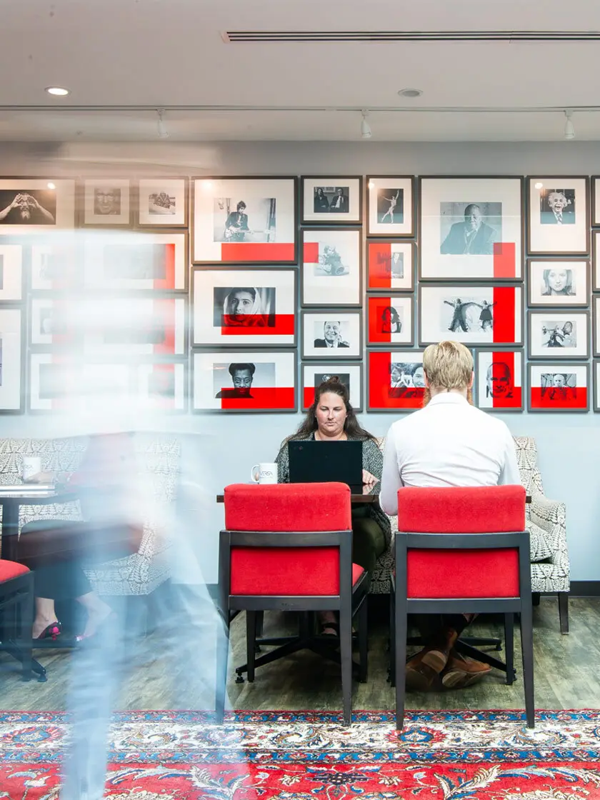
- Versa had an expansive color palette that included a beautifully vibrant red, but it was almost non-existent on the site and in their marketing collateral.
- Versa had a clean, versatile sans-serif font in their brand guide, but the serif paired with it on the website lacked the structure and attention to detail representative of the Versa experience.
For the new site design, we elevated the vibrant red from Versa’s palette and used that as the main color element throughout the site. The higher saturation allowed us to communicate important characteristics of the Versa brand, draw attention to important calls to action, and create clear user experience design and branding pathways through the site.
We replaced Versa’s original web serif, Alegreya, with Playfair Display. Alegreya can give a sort of old-world feel, and its details begin to look less than polished at smaller sizes. It’s the opposite of Versa’s approachable sophistication.
The switch to Playfair Display created more structure in the headlines and allowed us to play with contrasting weights and sizes to create a clear hierarchy of information.
Though small parts of a much larger process and design plan, adjusting these two elements in a purposeful way improved the brand expression in web design and enhanced the user experience.

Brand Expression in Web Design Common Questions:
When creating a new website design, many businesses wonder how to balance modern aesthetics with authentic brand representation. It’s a valid question: can small design adjustments really transform how users perceive a brand? Absolutely. Let’s delve deeper into some common questions about brand expression in web design:
How do you ensure a website design aligns with a brand’s personality?
The foundation lies in truly understanding the brand. Through discovery sessions and collaborative discussions, it’s essential to identify the core elements of a brand’s personality—what makes it unique, how it has evolved, and how audiences perceive it. From there, these insights shape the design choices, ensuring everything from color palettes to typography communicates the brand’s identity effectively.
Why is color so critical in brand expression?
Color is so important when it comes to brand expression in web design because it isn’t just visual; it’s emotional. In Versa’s case, elevating the vibrant red from their palette brought energy and focus to their website. Using bold, strategic colors helps define user pathways, highlight important calls to action, and convey the brand’s character. It’s about creating a visual language that resonates with users on a deeper level.
How can typography impact user perception?
Typography does more than make words readable—it sets the tone for your brand’s communication. Versa’s transition from Alegreya to Playfair Display exemplifies how font choices can shift a website’s personality. Alegreya’s old-world feel didn’t align with Versa’s modern sophistication, whereas Playfair Display offered structure, clarity, and a refined touch that matched their brand identity.
What role does user experience play in brand design?
User experience (UX) design is inseparable from branding. Every interaction on a website should reinforce the brand’s values and story. For Versa, focusing on purposeful UX pathways—guided by the elevated color palette and improved font hierarchy—ensured their site was not just functional but also reflective of their identity.
By considering these elements holistically, it’s possible to create a website that doesn’t just look good but also tells a compelling brand story.

